6 Paint Colors You Should Never Use in Your Bedroom
Discover 6 paint colors to avoid in your bedroom for a restful retreat. Learn why bright and moody hues disrupt sleep and explore soothing alternatives.
The bedroom is your sanctuary—a space designed for rest, relaxation, and rejuvenation. The colors you choose for its walls play a critical role in shaping its atmosphere, influencing your mood, and even affecting your sleep quality. While personal taste matters, certain paint colors can disrupt the calming environment needed for a restful retreat. Bright, overstimulating hues and heavy, moody tones can make it harder to unwind, while outdated or stark shades may feel uninviting or dated. To help you create a serene bedroom, we’ve consulted interior design experts and color theory principles to identify six paint colors to avoid and offer better alternatives for a peaceful space.
Why Bedroom Paint Colors Matter
Color psychology shows that hues impact emotions and physiological responses. In a bedroom, where relaxation and sleep are paramount, the wrong color can create chaos, discomfort, or even sleeplessness. According to Bailey Li, founder of Bailey Li Interiors, “The bedroom should feel like a cocoon—calm, inviting, and conducive to rest.” Choosing the right shade involves considering how it interacts with natural and artificial light, the room’s size, and your desired mood. Testing paint samples under different lighting conditions is essential to ensure the color feels soothing throughout the day.
Paint Colors to Avoid in Your Bedroom
Below, we explore six paint colors that interior designers and color experts recommend steering clear of in the bedroom, along with reasons why they can disrupt your space and suggestions for better alternatives.
1. Stark White
White might seem like a safe, timeless choice, but stark, cool whites can feel sterile and uninviting, especially under artificial lighting. Bailey Li explains, “Cool whites lack the warmth needed for a cozy bedroom retreat.” These shades often reflect light harshly, creating a clinical atmosphere that’s far from restful. Color expert Annie Woolf adds, “White’s high reflectivity can strain the eyes, making it harder to relax.”
Why to Avoid: Stark white feels cold and impersonal, potentially disrupting sleep by creating a harsh, uninviting environment.
Better Alternatives: Opt for warmer whites with creamy or beige undertones, such as:
- Benjamin Moore’s White Dove (OC-17): A soft, warm white with a touch of gray.
- Farrow & Ball’s Slipper Satin (No. 2004): A creamy off-white that feels inviting.
- Sherwin-Williams’ Alabaster (SW 7008): A versatile, warm white that softens a space.
Pro Tip: Pair warm whites with soft textures like linen bedding or natural wood furniture to enhance coziness.
2. Bright Purple
Bright purple is bold and energizing, but it’s a poor fit for a bedroom. Andrea Magno, director of color marketing and design at Benjamin Moore, notes, “Warm colors like bright purple, red, or orange stimulate energy, which can interfere with relaxation.” In color theory, purple’s vibrancy can feel intense, making it difficult to create a calming atmosphere.
Why to Avoid: Bright purple’s high energy can overstimulate, disrupting the serene vibe needed for sleep.
Better Alternatives: Choose muted, cooler purples with gray or blue undertones:
- Benjamin Moore’s Crocus Petal Purple (2071-40): A soft, ethereal violet.
- Farrow & Ball’s Calluna (No. 270): A gentle, heather-like purple.
- Backdrop’s Gin Blossoms: A pale mauve with earthy undertones.
Pro Tip: Use bold purples sparingly in accessories like throw pillows or curtains to add personality without overwhelming the space.
3. Yellow
Yellow is cheerful and luminous, often associated with sunlight and energy. However, these qualities make it less ideal for a bedroom. “Yellow’s brightness can mimic daylight, signaling your brain to stay alert,” says Magno. In dimly lit rooms, vibrant yellows can feel even more intense, creating an overstimulating environment.
Why to Avoid: Yellow’s bold, sunny energy can make it harder to wind down and may feel overwhelming in low-light conditions.
Better Alternatives: Opt for muted, earthy yellows that offer warmth without intensity:
- Farrow & Ball’s Hay (No. 37): A soft, caramel-like yellow.
- Benjamin Moore’s Heirloom Gold (154): A sophisticated, pale gold.
- Behr’s Golden Straw (M290-3): A subtle, creamy yellow.
Pro Tip: If you love yellow, use it in small doses through bedding or artwork to add warmth without dominating the space.
4. Red
Red is a powerful, passionate color that raises energy levels—great for social spaces but challenging in a bedroom. “Red can increase heart rate and make it harder to relax,” says Li. Its intensity can feel overwhelming, especially in a space meant for rest. Even in small rooms, red can make the space feel smaller and more chaotic.
Why to Avoid: Red’s stimulating nature disrupts the calm needed for sleep and can feel too intense for a restful retreat.
Better Alternatives: Choose muted, earthy reds for a softer effect:
- Farrow & Ball’s Red Earth (No. 64): A warm, terracotta-like hue.
- Benjamin Moore’s Rosy Peach (2089-20): A gentle, blush-toned red.
- Little Greene’s Bronze Red: A deep, muted burgundy.
Pro Tip: Use red as an accent color in furniture or decor, such as a terracotta headboard or burgundy throw, to add warmth without overpowering.
5. Orange
Like red, orange is vibrant and energizing, better suited for lively spaces like kitchens or dining rooms. Mary Patton, founder of Mary Patton Design, explains, “Bright orange feels out of place in a bedroom, where relaxation is key.” Its bold warmth can disrupt the calm needed for sleep, especially in vivid shades.
Why to Avoid: Orange’s high-energy vibe can make it difficult to unwind and may feel jarring in a restful space.
Better Alternatives: Opt for softer, earthy oranges that provide warmth without intensity:
- Behr’s Terra Cotta Urn (M200-5): A rich, grounding terracotta.
- Farrow & Ball’s Tangerine Dream (No. 93): A muted, peachy orange.
- Benjamin Moore’s Fall Harvest (2167-30): A subtle, desert-inspired orange.
Pro Tip: Pair terracotta tones with neutral bedding or pale blue accents to balance warmth and calm.
6. Black and Dark Gray
Moody, dark colors like black and deep gray are trendy, but they can make a bedroom feel heavy or claustrophobic. “Black absorbs light, draining energy from the space,” says Annie Woolf. While dramatic, these shades can feel oppressive, especially in smaller rooms or those with limited natural light. Magno adds, “Dark colors work best when balanced with lighter tones to avoid overwhelming the room.”
Why to Avoid: Black and dark gray can create a gloomy, enclosed atmosphere, making the bedroom less inviting for rest.
Better Alternatives: Choose softer, lighter grays or warm neutrals:
- Farrow & Ball’s French Gray (No. 18): A warm, versatile gray with green undertones.
- Benjamin Moore’s Revere Pewter (HC-172): A balanced, greige tone.
- Sherwin-Williams’ Agreeable Gray (SW 7029): A soft, adaptable neutral.
Pro Tip: If you’re drawn to dark tones, consider an accent wall or use dark colors in furniture or textiles to add depth without dominating.
The Impact of Color on Sleep
Color psychology highlights how hues influence mood and sleep. Bright, warm colors like red, orange, and yellow stimulate the brain, increasing alertness and potentially disrupting sleep cycles. Conversely, cooler, muted tones like blues, greens, and soft purples promote calmness, helping signal the body to relax. A study from the National Sleep Foundation suggests that calming bedroom environments, including color choices, can improve sleep quality by reducing stress and anxiety.
Table: Color Impact on Sleep
| Color | Effect on Mood | Sleep Impact |
|---|---|---|
| Bright Red | Energizing, passionate | Increases heart rate, disrupts sleep |
| Bright Yellow | Cheerful, stimulating | Mimics daylight, hinders relaxation |
| Bright Purple | Bold, creative | Overstimulates, less restful |
| Black/Dark Gray | Dramatic, heavy | Feels gloomy, may sap energy |
| Stark White | Clean, sterile | Harsh on eyes, less inviting |
| Bright Orange | Warm, social | Too vibrant, disrupts calm |
Better Color Choices for a Restful Bedroom
To create a serene bedroom, focus on colors that promote relaxation and complement your space’s lighting and size. Here are some expert-recommended alternatives:
1. Pale Blue
- Why It Works: Pale blue mimics the sky, evoking calmness and serenity.
- Top Picks: Benjamin Moore’s Breath of Fresh Air (806), Farrow & Ball’s Powder Blue (No. 23).
- Pair With: White bedding, natural wood, or muted earth tones.
2. Terracotta
- Why It Works: This earthy hue adds warmth without overstimulation.
- Top Picks: Benjamin Moore’s Topaz (070), Farrow & Ball’s Red Earth (No. 64).
- Pair With: Crisp whites, sage green, or brass accents.
3. Sage Green
- Why It Works: Sage green brings nature’s calming influence indoors.
- Top Picks: Farrow & Ball’s Calke Green (No. 34), Sherwin-Williams’ Evergreen Fog (SW 9130).
- Pair With: Neutral linens, copper accents, or pale pink.
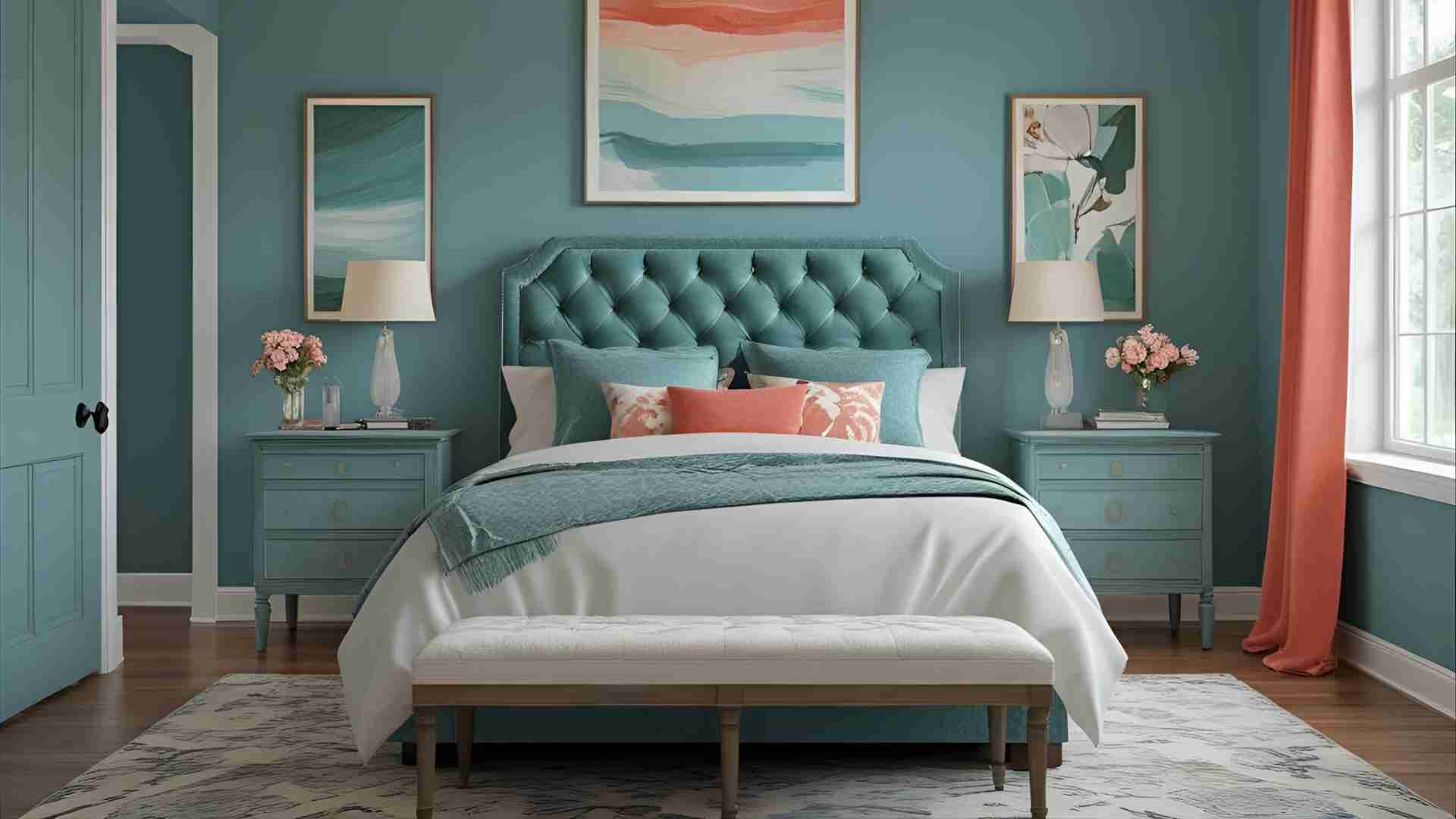
4. Pale Mauve
- Why It Works: This muted purple feels romantic and earthy, ideal for relaxation.
- Top Picks: Benjamin Moore’s Mauve Mist (1266), Little Greene’s Hellebore.
- Pair With: Green plants, dark wood, or multicolored furnishings.
5. Periwinkle
- Why It Works: A whimsical blend of blue and lavender, periwinkle feels soothing yet unique.
- Top Picks: Benjamin Moore’s Lily Lavender (2071-60), Behr’s Periwinkle Bud (M450-4).
- Pair With: Light grays, white accents, or soft metallics.
Chart: Bedroom Color Decision Flowchart

Practical Tips for Choosing Bedroom Paint
- Test Samples: Paint small patches on your walls and observe them under natural and artificial light to see how they change throughout the day.
- Consider Room Orientation: North-facing rooms benefit from warm tones (e.g., terracotta, beige), while south-facing rooms suit cooler hues (e.g., pale blue, sage green).
- Balance with Decor: Use bold colors sparingly in accessories like bedding or curtains to add personality without overwhelming the space.
- Think Longevity: Avoid trendy shades that may feel dated quickly, such as overly vibrant greens or Barbie pink. Stick to timeless hues for lasting appeal.
- Consult a Color Wheel: Analogous color schemes (e.g., blue and green or pink and terracotta) create harmony, while complementary colors add subtle contrast.
Pricing and Specifications
Paint prices vary by brand and finish. Below is a table with estimated costs for recommended colors from top brands (based on a 1-gallon can, covering approximately 350-400 square feet):
Table: Paint Color Pricing
| Color | Brand | Product Name | Price (USD) | Finish Options |
|---|---|---|---|---|
| Pale Blue | Benjamin Moore | Breath of Fresh Air | $45–$80 | Matte, Eggshell |
| Terracotta | Farrow & Ball | Red Earth | $110–$120 | Estate Emulsion |
| Sage Green | Sherwin-Williams | Evergreen Fog | $50–$85 | Flat, Satin |
| Pale Mauve | Little Greene | Hellebore | $90–$100 | Absolute Matt |
| Periwinkle | Behr | Periwinkle Bud | $35–$60 | Flat, Semi-Gloss |
| Warm White | Sherwin-Williams | Alabaster | $50–$85 | Flat, Eggshell |
Note: Prices vary by retailer and region. Check with local suppliers or brand websites (e.g., benjaminmoore.com, farrow-ball.com) for exact costs.
Expert Insights on Creating a Restful Bedroom
Interior designers emphasize the importance of aligning color choices with your personal needs and the room’s function. Andrew Griffith, founder of A New Day, advises, “Think about whether you want a bright, airy bedroom or a cozy, cocoon-like space. Then choose colors that enhance that feeling.” For example, those seeking a light-filled space might prefer pale blues or creamy whites, while those wanting warmth might lean toward terracotta or sage green.
Tash Bradley, color expert at Lick Home, warns against colors that sap energy: “Gray can feel like waking up to a cloudy day, draining motivation.” Instead, she recommends warm, earthy tones or soft pastels to create an inviting atmosphere.
Conclusion
Your bedroom’s paint color sets the tone for rest and relaxation. Avoiding overstimulating colors like bright red, yellow, orange, and purple, as well as heavy tones like black and dark gray or stark whites, ensures a serene environment. Instead, embrace calming hues like pale blue, terracotta, sage green, or periwinkle to create a restful retreat. By testing samples, considering lighting, and balancing with thoughtful decor, you can craft a bedroom that feels like a true sanctuary, promoting better sleep and a sense of calm.
Please share this 6 Paint Colors You Should Never Use in Your Bedroom your friends and do a comment below about your feedback.
We will meet you on next article.
Until you can read, Fireplace Vs Wood Stove: Deep Dive Comparison